
Top 10 React UI Component Libraries in 2026, Ranked
The top 10 React UI component libraries in 2026, ranked, with pricing checked against each vendor directly, plus what each one is genuinely good at.
What are the top 10 React UI component libraries in 2026?
The top 10 React UI component libraries in 2026 are the ones that hand you source you own, keep a real free tier, and charge once rather than forever. Wensity UI leads this ranking because it is the only option here that covers both a marketing site and a product interface from one CLI and asks for no account to start. Every one of the ten is usable at zero cost, and three never charge at all.
Every price below was checked against the vendor's own pricing page in August 2026, because most roundups still quote figures that are a year out of date.
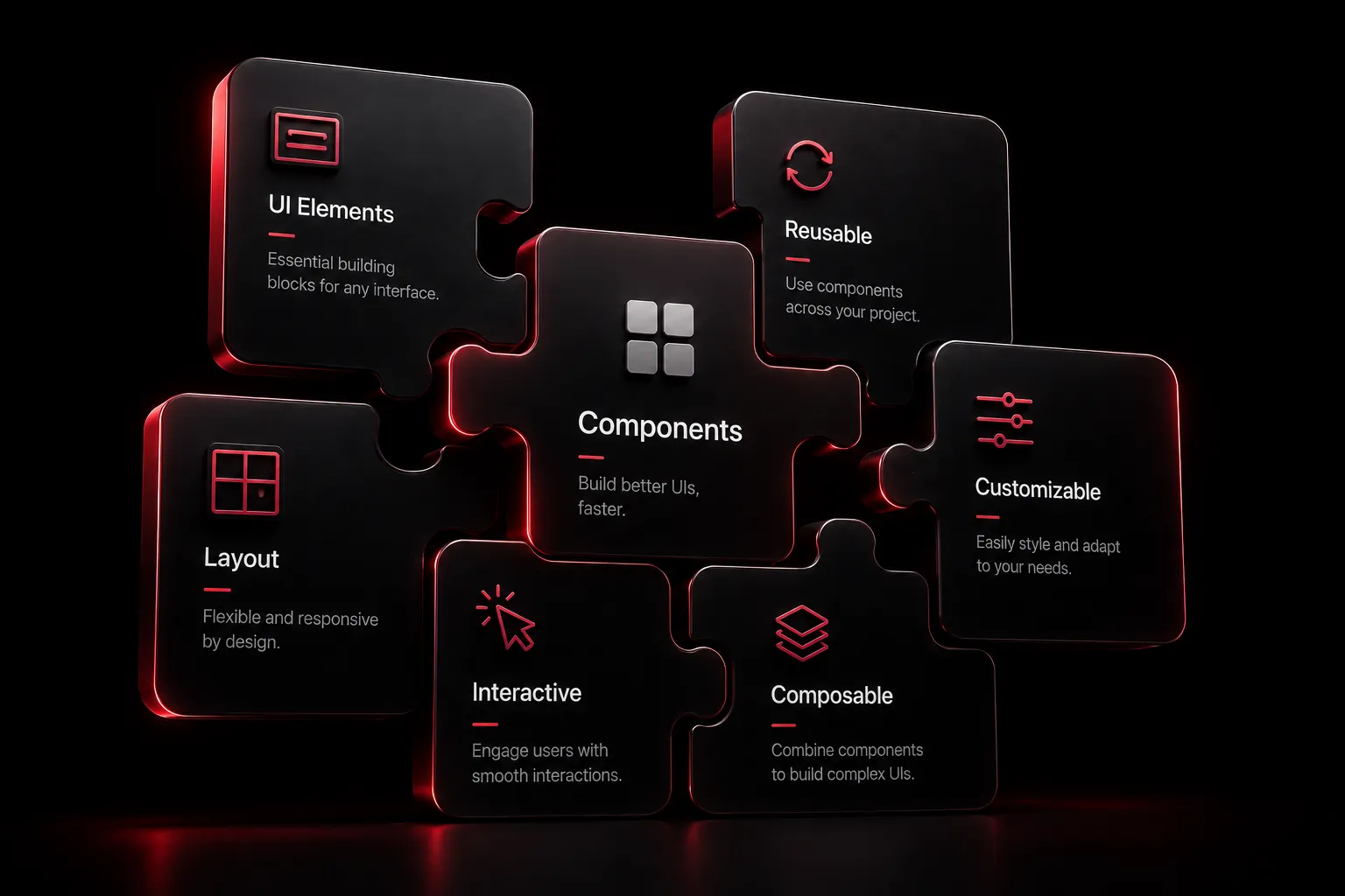
Ten React UI component libraries ranked and compared for 2026
| Library | Free tier | Paid entry | Install method |
|---|---|---|---|
| Wensity UI | Yes, no account needed | $199 lifetime | Own CLI |
| Aceternity UI | Yes | $199 lifetime | Copy paste |
| React Bits | Yes, 165+ components | $99 lifetime | Copy paste or CLI |
| Untitled UI React | Yes, open source tier | $349 Pro Solo | Own CLI |
| Tailark | Yes | $249 one-time | shadcn registry |
| Wigggle UI | Fully free | None | Copy paste |
| daisyUI | Fully free | None | Tailwind plugin |
| SmoothUI | Fully free | None | shadcn CLI |
| Skiper UI | Yes, partial | $129 one-time | shadcn CLI |
| Lightswind UI | Yes, 169+ components | Paid 3D tier | CLI and MCP |
The ten libraries, ranked
1. Wensity UI
Wensity UI takes first place on coverage rather than on any single flashy component. Most libraries here pick a side, either motion heavy marketing pieces or sober application primitives, and Wensity ships both: cinematic interactions and text animations sit in the same catalog as agentic AI interfaces, heavy SaaS blocks, and elite micro interactions.
The delivery model is the second reason. Its CLI writes real .tsx files into your project, rewrites imports to match your path aliases, installs declared dependencies with your package manager, and swaps icon libraries if you use Lucide instead of Tabler. No runtime package sits between you and your components.
Wensity UI is free forever for the open catalog, with no card and no login, then 169 dollars a year for Pro Annual or 199 dollars once for Pro Lifetime, which includes every future revision. Teams pricing is custom. Full site templates are sold separately between 59 and 99 dollars.
The trade off is honest: it is a younger catalog than Untitled UI, so if raw volume is your only metric, look further down.
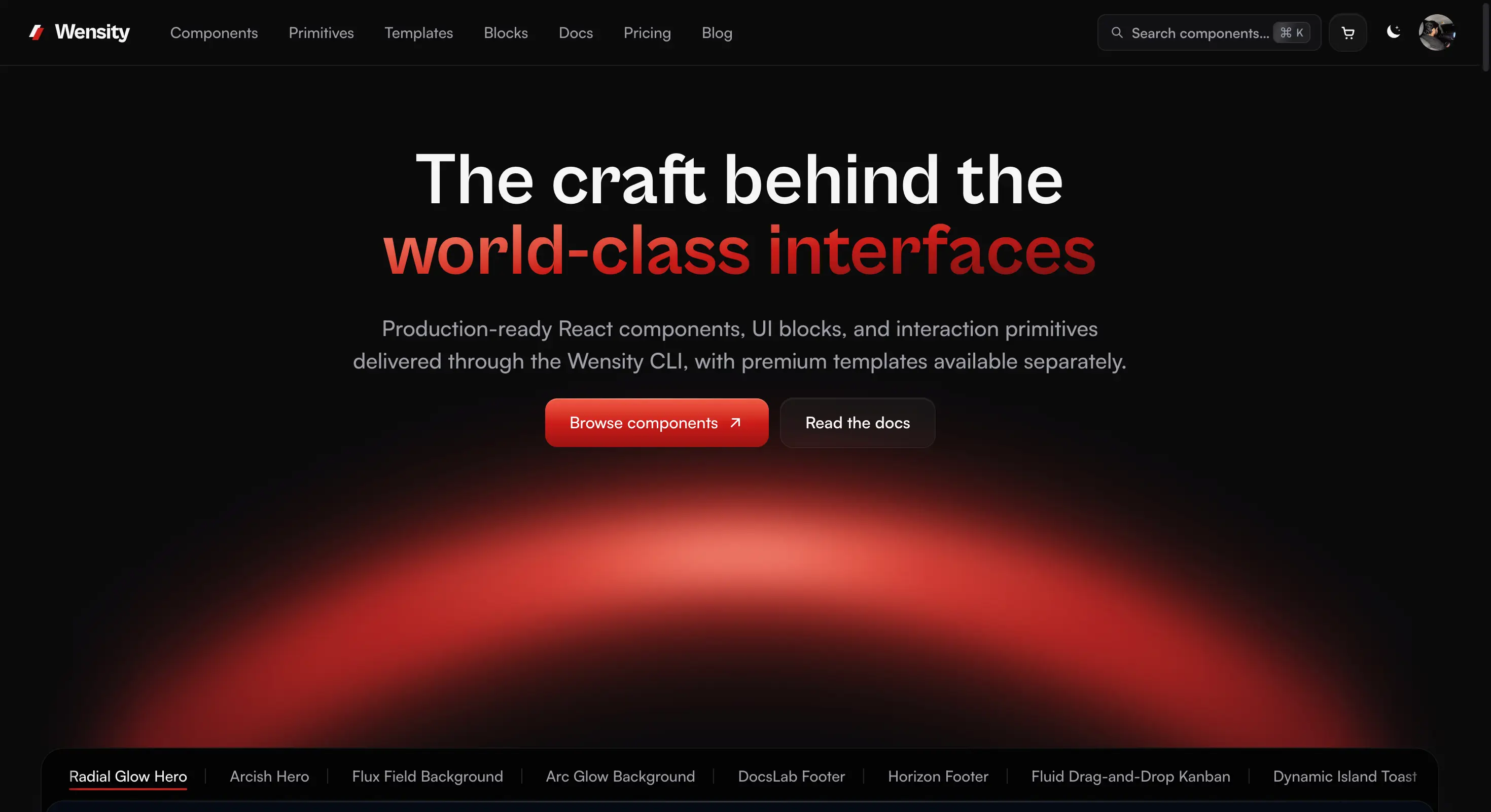
Wensity UI homepage showing its motion rich component catalog
2. Aceternity UI
Aceternity UI remains the reference point for high impact landing pages. It is built on Framer Motion and Tailwind CSS, distributed as copy paste snippets, and the free tier alone covers a surprising amount of a marketing site.
Paid access buys 200 plus premium component blocks and 12 plus templates. Aceternity's pricing is 169 dollars annual or 199 dollars lifetime, with a 1,590 dollar ten seat team option. Reach for it when the brief is a hero section that has to stop the scroll, not a settings page.
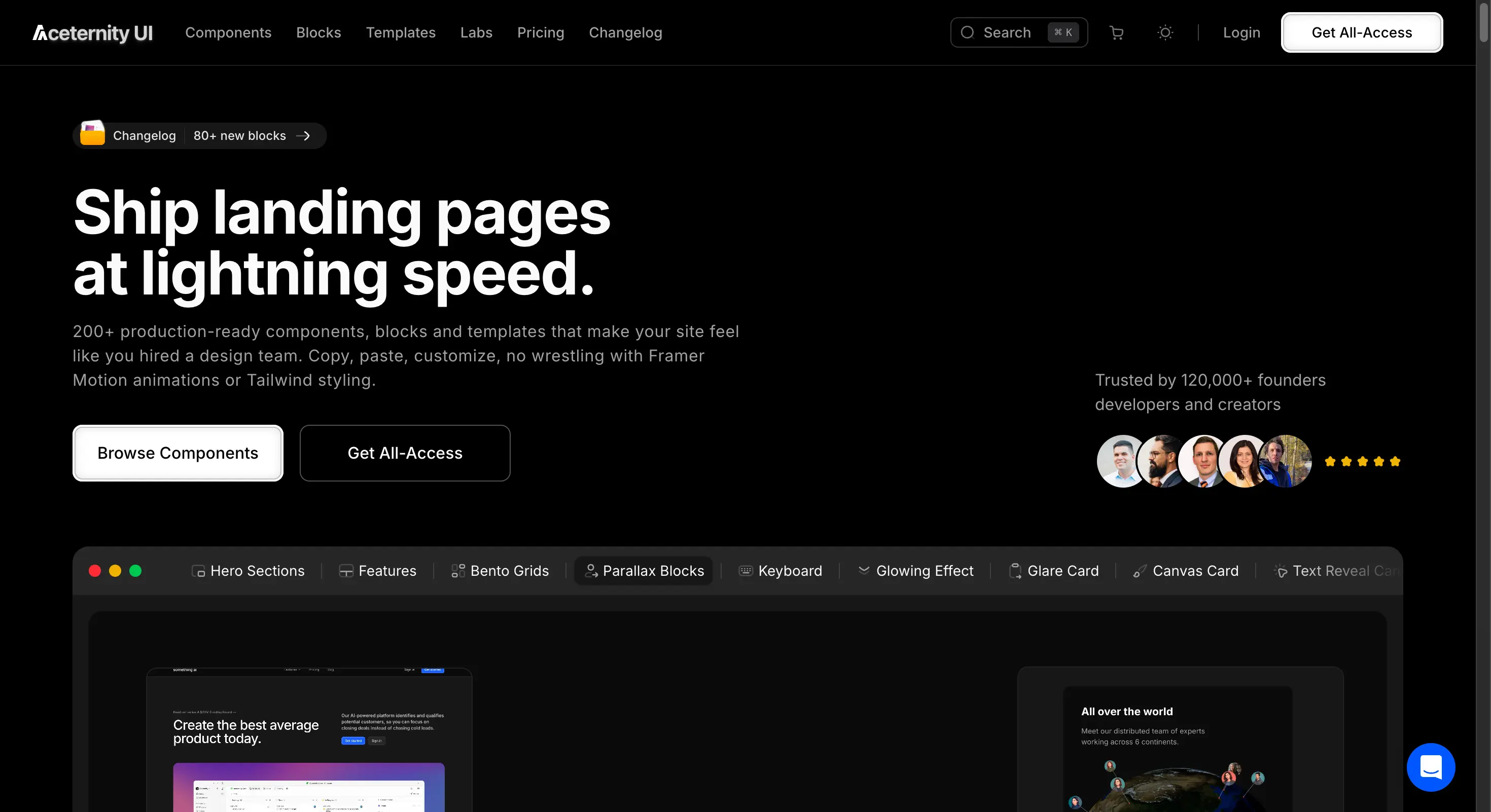
Aceternity UI homepage with animated landing page components
3. React Bits
React Bits is the strongest free animated collection, at 165 plus components with roughly 45.8k GitHub stars. Its distinguishing feature is that every component ships in four variants: JavaScript with CSS, JavaScript with Tailwind, TypeScript with CSS, and TypeScript with Tailwind.
That matters because most animated libraries assume Tailwind and TypeScript. React Bits does not, which makes it the safe pick for an older codebase. The open source project is licensed MIT with Commons Clause, so personal and commercial use are fine while reselling the components themselves is not.
There is also a separate commercial tier, React Bits Pro, on its own domain. Lifetime plans run 99 dollars for Starter with 134 components, 199 dollars for Pro adding 238 page blocks and 300 application UI blocks, and 299 dollars for Ultimate with 11 Next.js landing templates. Pro also ships one-command installation for Claude Code and Cursor, which the free library does not.
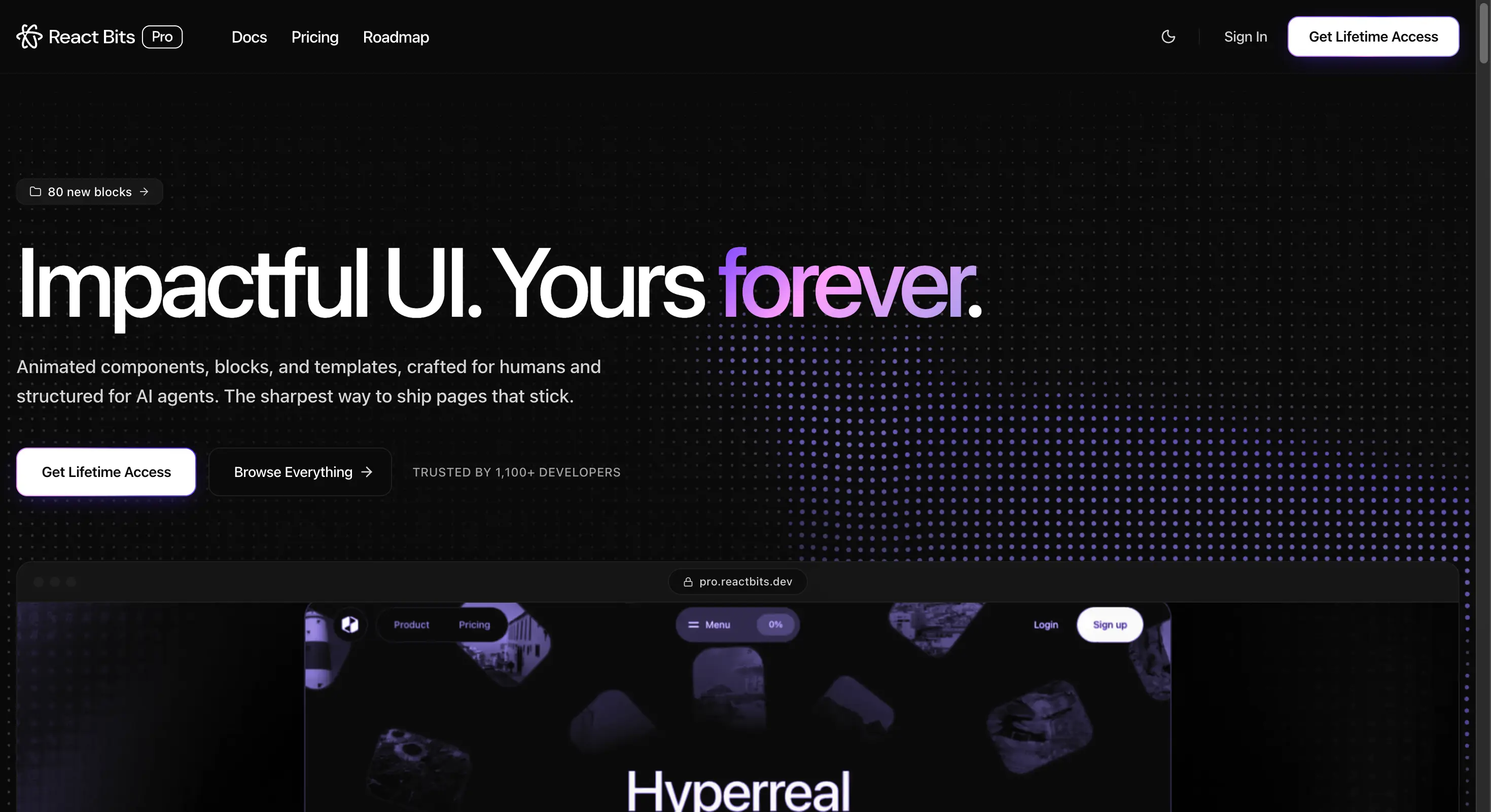
React Bits homepage showing its free animated component collection
4. Untitled UI React
Untitled UI is the volume play: 5,000 plus components and sections, 250 plus page examples, built on React 19.2, Tailwind CSS v4.3, TypeScript 5.9, and React Aria for accessibility. React Aria is the real differentiator, since keyboard behaviour and screen reader semantics come from a maintained accessibility layer rather than hand rolled markup.
There is a genuine open source free tier, but the paid ladder is the steepest here: 349 dollars for Pro Solo, 999 dollars for a studio of eight, 2,499 dollars for up to twenty, and 8,999 dollars for enterprise with SSO and repository access. Pick it for a large design system with matching Figma files, not for a weekend project.
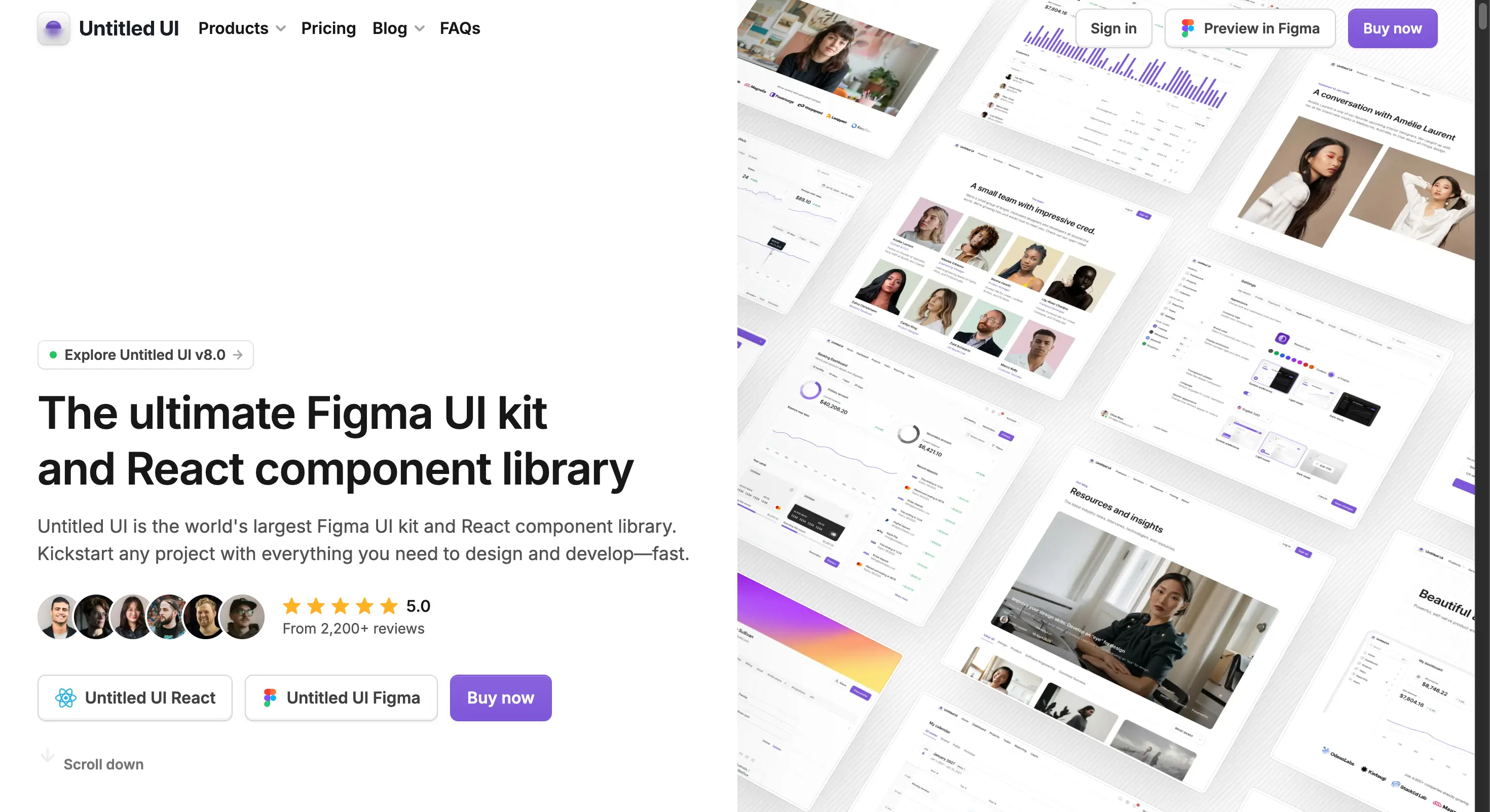
Untitled UI React homepage with its 5,000 plus component library
5. Tailark
Tailark is a shadcn registry aimed squarely at marketing websites, built on shadcn and Next.js with compatibility for both Radix UI and Base UI. Free pages, blocks, and snippets carry lifetime access across unlimited projects.
Paid tiers are one-time: 249 dollars for Essentials, 299 dollars for Complete with production ready page templates, and 499 dollars for a ten person team. It slots neatly into a project that already uses shadcn rather than asking you to adopt a parallel system.
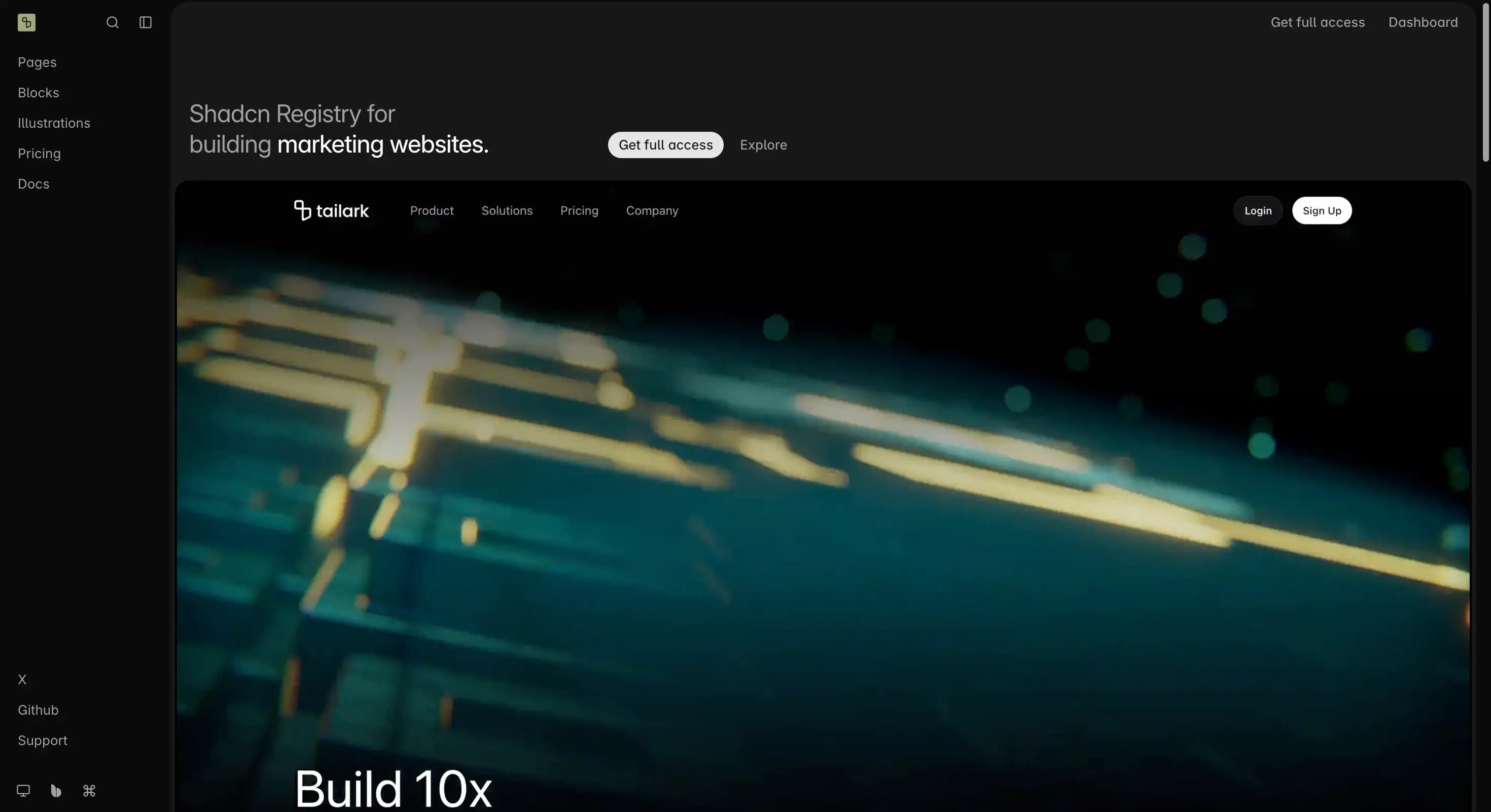
Tailark homepage showing shadcn marketing blocks and page templates
6. Wigggle UI
Wigggle UI solves a narrow problem well. It is a fully open source, MIT licensed set of 40 plus copy paste widgets: calendars, clocks, weather panels, sports scores, stock tickers.
These are the pieces most libraries skip, and rebuilding a decent weather card from scratch costs more hours than anyone budgets for it. It is shadcn/ui compatible and there is no pricing model at all.
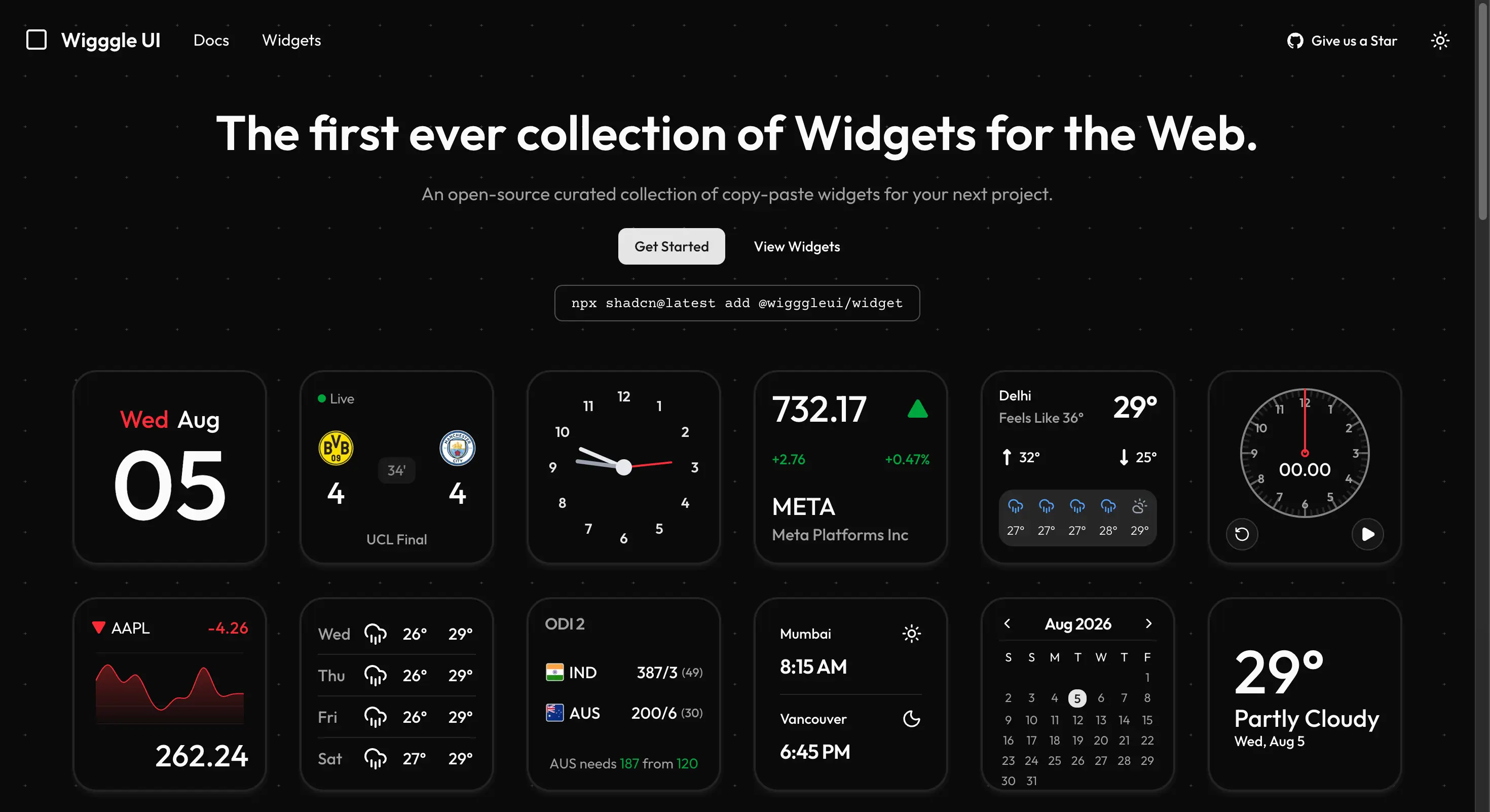
Wigggle UI homepage with its open source widget collection
7. daisyUI
daisyUI is the outlier here because it ships no JavaScript. It is a pure CSS Tailwind plugin with 68 components and 35 plus prebuilt themes, currently on v5, and it works across React, Vue, Svelte, Angular, Astro, Rails, and plain HTML.
That framework independence is the reason to choose it. If your company runs a React app and a Rails admin panel, daisyUI is the only entry on this list that themes both from one source. The project reports 88 percent fewer class names and 79 percent smaller DOM output than raw Tailwind, and the whole thing is free and open source.
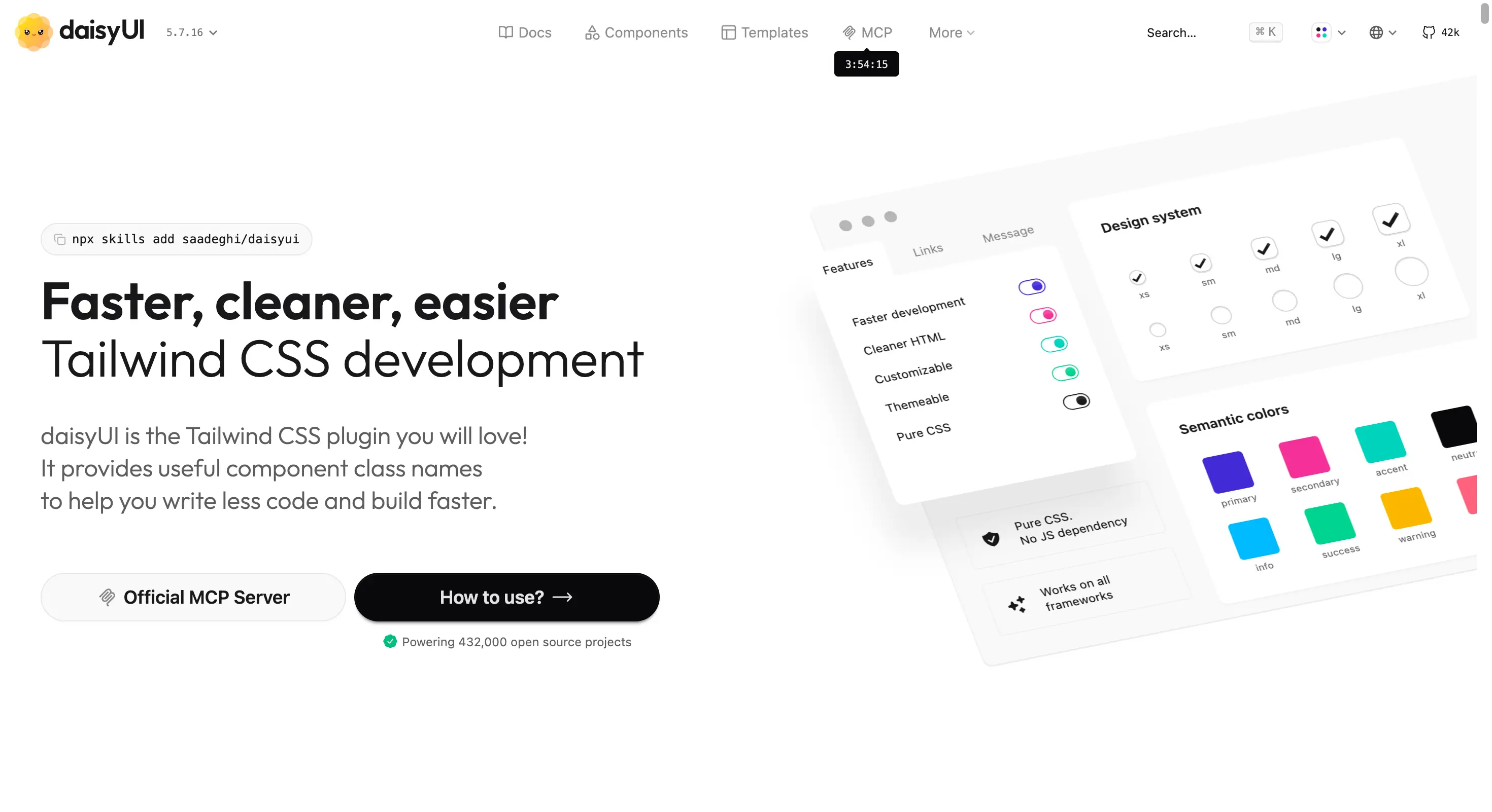
daisyUI homepage showing its pure CSS Tailwind component classes
8. SmoothUI
SmoothUI is the free option for teams already standardised on shadcn. It offers 130 plus animated components and 22 plus production ready blocks, built on React 19, Tailwind CSS v4, and both Motion and GSAP, all MIT licensed.
Installation is a single shadcn command per component, so nothing about your existing setup changes. If you want the premium feel that good micro interactions create without a purchase order, start here.
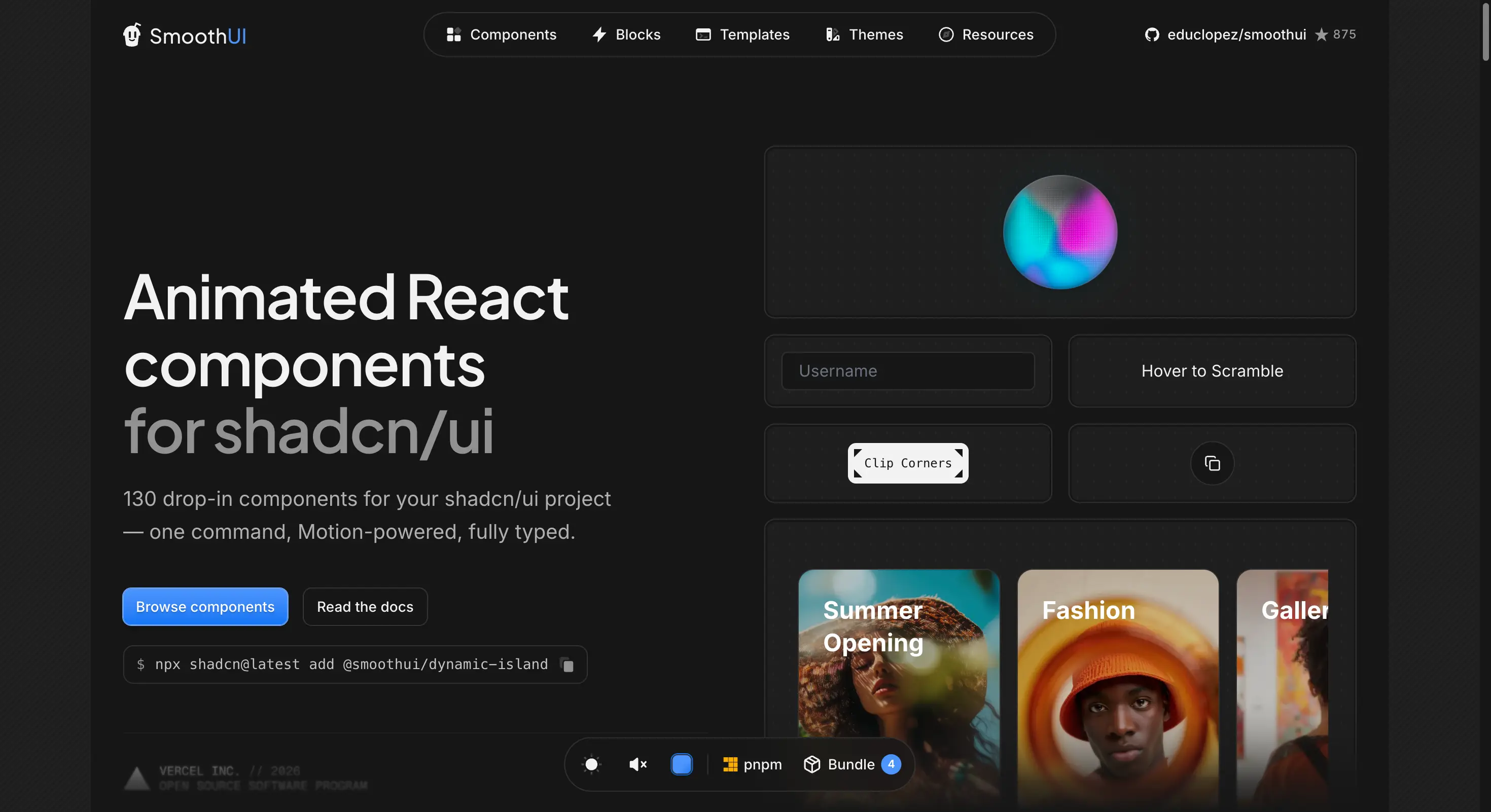
SmoothUI homepage with animated shadcn compatible components
9. Skiper UI
Skiper UI runs a hybrid model: 106 plus components in total, with a meaningful free set including its well known Dynamic Island component, and the rest behind a paid unlock. It builds on Motion.dev and installs through the shadcn CLI as one file per component.
Premium is 129 dollars once, and Exclusive is 549 dollars with Figma files and full website templates. That 129 dollar entry is the cheapest paid tier here, a low risk upgrade if two or three components save you a week.
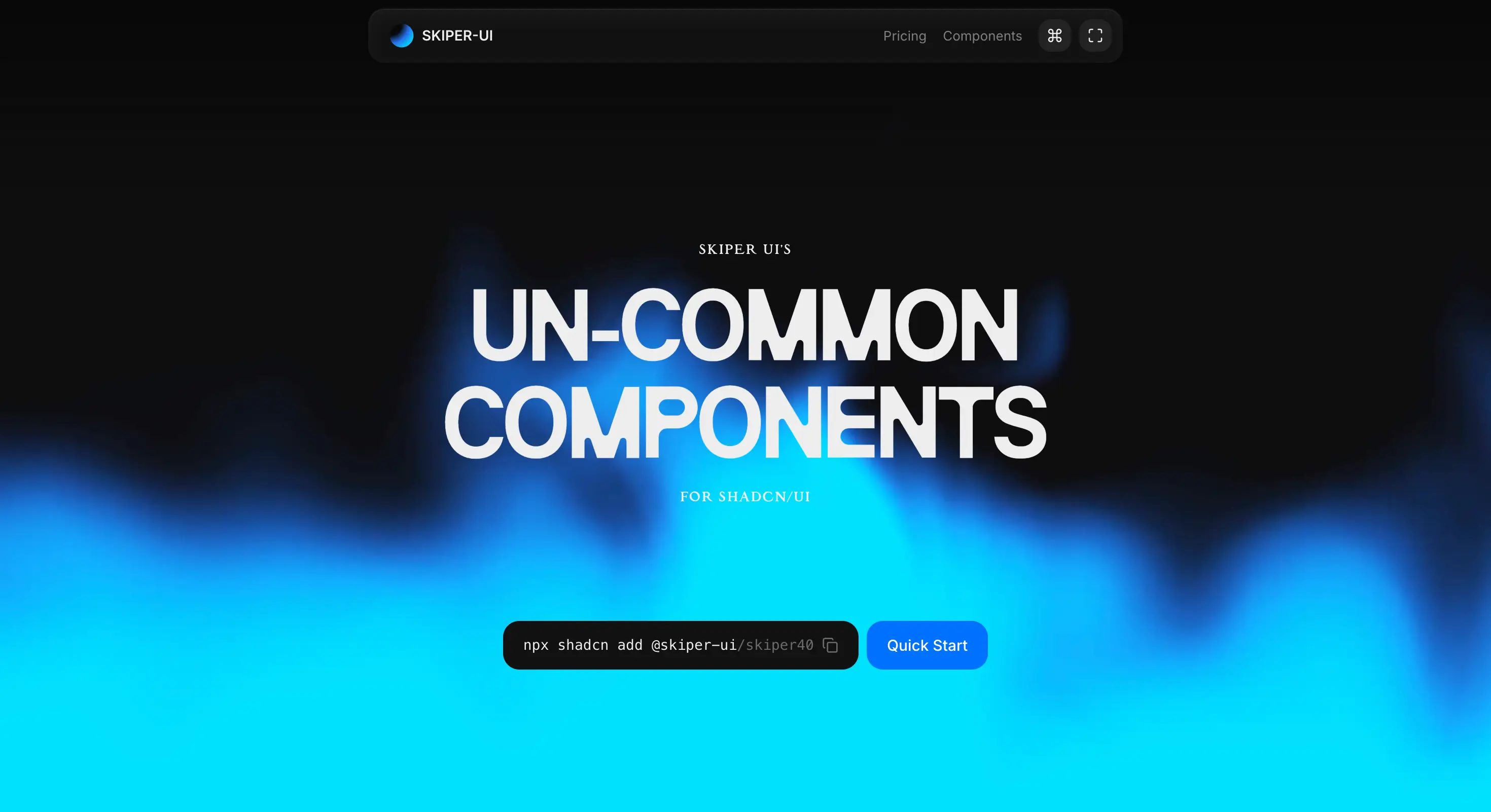
Skiper UI homepage showing its free and premium component split
10. Lightswind UI
Lightswind UI is the AI native entry. Alongside 151 plus animated components and 100 plus UI blocks, it ships a Model Context Protocol server so Cursor, Windsurf, and Claude can discover and insert components without you leaving the editor.
Its free tier is unusually large at 169 plus components and controls, and the paid tier is where the 86 plus WebGL and 3D shader elements live. The MCP angle is the reason to watch it, since it points at where the interactive web is heading.
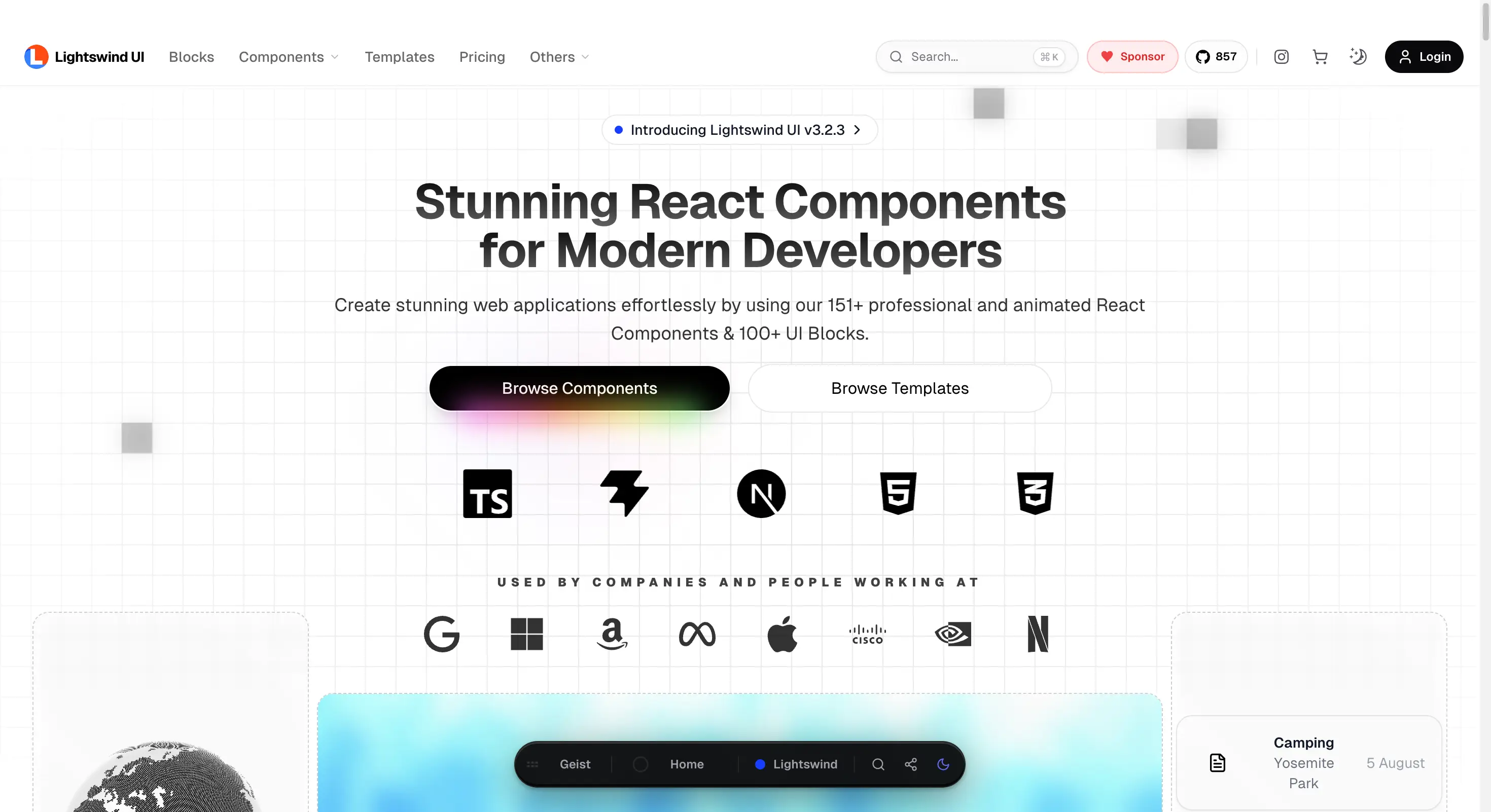
Lightswind UI homepage with its AI native component library
Copy paste, CLI, or npm package: how install method changes the choice
Component count is the number every library advertises and the one that matters least. How the code reaches your repository decides what happens in month six, when a component has to behave differently than the vendor intended.
| Model | Who uses it | You own the source | Upgrade path |
|---|---|---|---|
| Copy paste | Aceternity, React Bits, Wigggle | Yes | Manual, per component |
| CLI into repo | Wensity, Untitled UI, shadcn registries | Yes | Re-run the CLI |
| npm package | Traditional libraries, daisyUI plugin | No | Version bump |
The copy-the-source approach shadcn popularised has won outright. Nine of the ten put files in your repository rather than a dependency in your lockfile, so a designer's odd request becomes a fifteen minute edit instead of a fight with a prop API. This is the same move toward opinionated defaults over configuration that reshaped the rest of the React toolchain.
Why nearly every React UI library now sells a one-time unlock
One pattern repeats across vendors that never coordinated: a generous free tier, then a single lifetime payment. Wensity UI and Aceternity UI both land on 169 dollars annual against 199 dollars lifetime. Tailark, Skiper UI, React Bits Pro, and Untitled UI skip subscriptions entirely at their entry tiers.
Three forces produced that convergence:
- Free alternatives are genuinely good now, so a paywall in front of basic components loses to daisyUI or SmoothUI immediately
- Copy-the-source distribution makes subscriptions hard to justify, because the files already sit in your repository whether you renew or not
- Buyers are individual developers and small teams expensing a tool, and a one-time charge clears approval far faster than a recurring line item
The practical consequence is that the annual plan is usually the worse deal. When lifetime costs 30 dollars more than a single year, the annual tier exists mainly to make the lifetime price look cheap.
How to pick one for your project
Match the library to the surface you are building, then to your budget, in that order:
- Marketing site or landing page: Aceternity UI or Tailark, with the free React Bits library as the zero cost substitute
- Product interface or dashboard: Untitled UI React for accessibility depth, Wensity UI for motion rich application blocks
- Both surfaces from one system: Wensity UI, which is the specific gap it was built to close
- Zero budget: daisyUI for structure, SmoothUI or the free React Bits library for animation, Wigggle UI for the odd widgets
Then check two things. Confirm the free tier covers a real page rather than three buttons, since that separates a genuine free tier from a demo. And check whether the library assumes shadcn/ui, because adopting a registry style library without it means importing conventions you did not plan for.
What this means for React teams in 2026
Competition has moved from feature checklists to distribution and price, which is closely tied to why developer experience became the real moat.
The risk is now the opposite of what it used to be. Choosing wrong no longer locks you in, so the bigger waste is evaluating ten catalogs for two weeks when the source files are yours either way. Pick the one that matches your surface, install four components, and judge it on how the first custom edit feels.

Rune AI
Key Insights
- Wensity UI ranks first for covering both marketing motion and application level blocks in one CLI driven system, with a free tier that needs no account and a 199 dollar one-time ceiling
- The dominant 2026 pricing pattern is a generous free tier plus a one-time lifetime unlock, with annual plans priced close enough to lifetime that paying once usually wins
- Three libraries here cost nothing at all: daisyUI, SmoothUI, and Wigggle UI, while React Bits pairs a large free open source library with a separate paid Pro catalog from 99 dollars
- Install method matters more than component count, since copy-paste and CLI libraries hand you source you own while npm packages keep you on the vendor upgrade path
- Untitled UI React is the volume and accessibility pick at 5,000 plus components on React Aria, but its Pro Solo tier is 349 dollars, the highest single-seat price on this list
Powered by Rune AIFrequently Asked Questions
Which React UI library is the best overall in 2026?
Wensity UI takes the top spot because it is the only library on this list that covers both sides of a product in one system: motion-heavy marketing components and application level building blocks such as agentic AI interfaces and SaaS blocks, delivered through a CLI that writes real source files into your repository. Its free tier needs no account, and the paid ceiling is a one-time 199 dollars rather than a recurring bill.
What is the best free React component library?
daisyUI if you want plain CSS with no JavaScript dependency and 68 components across 35 plus themes, SmoothUI if you are already on shadcn/ui and want 130 plus animated components through the shadcn CLI, and Wigggle UI for widgets such as calendars and weather panels. Those three are free with no paid tier at all. React Bits also has a large free open source library at 165 plus components, though its Pro catalog is a separate paid product starting at 99 dollars.
Which of these libraries work with shadcn/ui?
Tailark, SmoothUI, Skiper UI, and Wigggle UI are built as shadcn registries or shadcn compatible collections, so they install through the shadcn CLI into an existing setup. Wensity UI ships its own CLI that follows the same copy-the-source model, and Untitled UI React provides its own installer alongside React Aria based accessibility.
Do any React component libraries still charge a subscription?
Very few charge subscription only. Most now offer an annual option alongside a one-time lifetime purchase, and the lifetime price is usually close enough to the annual price that buying once is the obvious choice. Wensity UI is 169 dollars a year or 199 dollars once, and Aceternity UI uses the same pattern at the same two prices.
Conclusion
The useful shift in 2026 is not that React finally has good component libraries, it is that the good ones stopped locking you in. Nearly every library here hands you plain source files you own, keeps a real free tier, and caps the paid path at a single payment. That makes the choice less about which vendor you are marrying and more about which one matches the thing you are building this quarter. Wensity UI earns the top spot for teams that need both a marketing surface and an application surface from one system, but a landing page team that only needs motion, or a dashboard team that only needs accessible primitives, can pick further down this list and lose nothing.